Key Features of a Mobile-Friendly Website
Let’s look at what mobile optimization is in more detail:
High performance is the key feature of mobile-first web development. Most mobile interactions are made ‘on the go’, thus users are eager to receive an immediate result. If the site loads slowly, users can abandon it forever.
The mobile version of the website can’t look the same as on the desktop. Scrolling to the right to see all content is not user-friendly at all. Develop a responsive web design to eliminate the right scroll. Make sure that all buttons and elements are big and convenient enough for touch screens. Test the website styling via numerous devices and browsers. The best solution for mobile web design might be the creation of an app-like experience: make a mobile version of the site look and function as if it was a mobile application.
Build intuitive navigation to make the interaction with your mobile website easy and clear. Ideally, the user has to get to the final web destination (or conversion) in 2-3 steps. In addition, think of the click-to-call navigation strategy by creating appealing and noticeable contact buttons or forms.
Optimized images make a huge improvement to the website loading speed. What’s more, you should consider the creation of Retina images: these are images that look shart on Retina screens. Retina screen is a special type of Apple Inc. display that provides a higher pixel density than a traditional screen. This means that the user won’t see pixels when he zooms the retina image.
- Minimal number of elements on the page
Prioritize quality over quantity. Reduce the number of elements on the web page and keep only important ones.
Mobile-First Approach in Drupal
In Drupal, the mobile-first approach doesn’t simply apply to responsive web design but also to content structure and web development. Being a mobile-oriented content management system, Drupal has shifted its focus on how the content is structured, how layouts are displayed, and how features function on mobile. As a CMS with an advanced level of flexibility and customizability, Drupal is easy to fine-tune for mobile requirements.
Web performance is another key factor that should be considered for a successful mobile optimization campaign. Luckily, Drupal web page loading speed can be improved with the help of special modules and configurations. Techniques like image optimization, caching, and code cleaning ensure faster loading times on both desktops and mobiles. Discover how to enhance Drupal website performance in our recent blog post.
Here at Drupfan, we prioritize mobile-first website building providing unique mobile experiences for each user no matter his role and permissions. This means that even advanced functionality with multiple menus, dashboards, and views will look and function flawlessly on mobile. Thus, web administrators or content editors can manage the website even from mobile devices.
Is Your Drupal Website Mobile-Optimized?
There are numerous online tools for mobile optimization check-ups available on the net. Let’s look at the most useful of them.
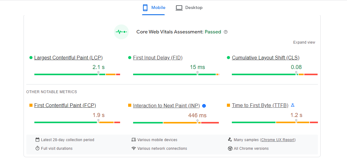
PageSpeed Insights is a tool that analyzes a website from different aspects and creates a detailed report on performance, accessibility, SEO optimization, and best practices both for mobile and desktop versions. At the top of the report, you can see Core Web Vitals Assessment. A well-optimized website is a website that passes this assessment. Below you can see some advice on how to improve the website optimization.
Mobile Friendly Test is another popular Google tool to check mobile optimization. It shows how your website looks on mobile devices.
Chrome DevTools is a set of Google Chrome built-in tools for web developers. In terms of mobile optimization, this tool can analyze runtime performance, provide insights on your website’s performance, emulate various mobile devices and screen sizes, conduct automated audits for web pages, and more.
Make Your Drupal Website Mobile-Optimized Today
Remember that a mobile-optimized website is an application-like site where users don’t have to zoom or scroll left and right. If you are not satisfied with the results of website audits, contact the Drupfam team of Drupal experts today for mobile optimization services. Let’s make your platform more powerful and better performing together!
 en
en
 fr
fr


